Accessible usage of color and contrast allows people to find and perceive content. When considering use of color in your design, it’s important to understand that color may look different to your audience – or they may not be able to see it at all.
Impact
Color should not be the only visual way of communicating information, indicating an action, or distinguishing a visual element from other content. When color is used alone, some people may not be able to access the information because:
- People with visual impairments or colorblindness may not be able to see the information or be able to tell what the color represents.
- Computers vary in color calibration.
- Monitor display settings for high contrast mode may render colors differently.
- Accessing the content on a device outdoors may affect vision.
Text color must be distinguishable from the background on which it is displayed to ensure readability. Failing to create appropriate contrast can lead to significant difficulties for multiple populations:
- People with decreased contrast sensitivity due to conditions such as glaucoma cannot read the text.
- It may increase eye strain and cognitive load.
- It may result in people overlooking important information, including buttons and links to other resources. This can impact everyone, but it significantly reduces accessibility for low vision users.
- It reduces accessibility for people with cognitive impairments that impact short-term memory and ability to maintain focus.
What to do
Color
Use color with another element to show emphasis or visually distinguish differences such as text descriptions, patterns, or shapes with alternative text. The University of Michigan offers some great illustrations to ensure correct practices on their page: Color as the Only Indicator of Meaning.

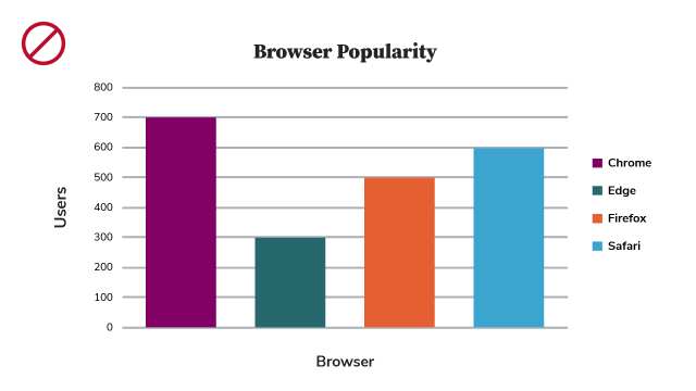
This first example of an inaccessible bar chart uses color as the only way to identify the relative popularity of several web browsers. Not everyone will be able to match up the colors to interpret the information in this chart, even though there is a legend.

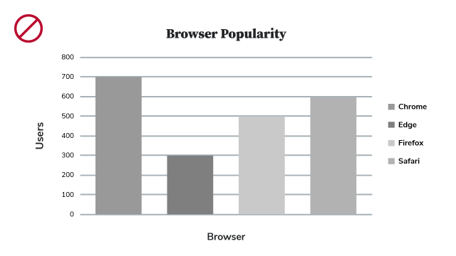
This second version of the bar chart displays the colors in grayscale to show how challenging it can be for people with vision impairments to decipher one color from another. This example is not accessible as it is very low contrast and provides almost no means to interpret the data presented in the chart.

This last version of the bar chart shows a more accessible example by using higher contrast colors as well as text labels below each column in the bar chart. Color is helpful here, but it is not the only means to interpret the data.
Contrast
Make sure the text color and the background color have sufficient contrast. Contrast is the difference in perceived brightness of two colors, and its measurement is called its “contrast ratio.” To help understand the ratios, white text on a white background has a contrast ratio of 1:1. Black text on a white background is 21:1. Use the color contrast tools linked below to explore and understand these ratios.
Requirements for contrast are as follows:
- Small Text: Text under 18-point regular font (14-point bold) must have a minimum 4.5:1 ratio with the background.
- Large Text: Text at or above 18-point font (14-point bold) must have a contrast ratio of at least 3:1 with the background.

Example: Button with good contrast
In this example, the scarlet button with white text has sufficient contrast, with a contrast ratio of 6.6:1.

Example: Button with low contrast
In this example, the light gray button with medium gray text displays insufficient contrast, with a contrast ratio of 2.94:1.
WebAIM offers some great examples of color contrast on its page WebAIM Contrast and Color Accessibility.
Tools to Test Color Contrast:
- WebAIM Contrast Checker - You can install the Contrast Checker Bookmarklet in your browser’s Bookmarks bar to easily access the Contrast Checker. The eyedropper color selector is not supported in Firefox.
- ContrastChecker.com - This tool was built for designers and developers to test color contrast compliance with the Web Content Accessibility Guidelines (WCAG) as set forth by the World Wide Web Consortium (W3C).
Things to avoid
- Avoid using color as the only way to emphasize a point or show differences in information.
- Avoid using text colors that aren’t readable against the background, including images with text on them.
- Avoid using color and an underline as a secondary way to show emphasis, as it could be misinterpreted as a hyperlink.