How to Test PowerPoint Presentations for Accessibility
When to Test
The guidance on this page is intended to help users evaluate presentations for accessibility. If the PowerPoint presentation is used to deliver information related to a program, service, or activity at OSU, it must be tested and remediated before sharing it with others.
For detailed information on basic accessibility requirements and how to produce accessible PowerPoint presentations, please review Producing Accessible PowerPoint Presentations.
Automated Accessibility Checker
The first step in evaluating a PowerPoint presentation for accessibility is to run the Accessibility Checker and fix the issues it identifies to help ensure people with disabilities can easily access the content. To run the Accessibility Checker:
- Select the Review tab on the ribbon.
- Select Check Accessibility
or
Keyboard Navigation: Alt+R, A, 1, A.
For detailed instructions on running the Accessibility Checker and applying recommended actions, review Microsoft’s Accessibility Checker guidance.
Manual Accessibility Checks
While the automated Accessibility Checker can identify many issues, some items require review by a human. Verify that your presentation is also meeting these requirements to ensure that people with disabilities can easily access the content:
Presentation Structure
Title
The title describes the topic or purpose of the presentation.
- Review the file name to make sure that it clearly describes the topic or purpose.
- Add a title in the presentation metadata that describes its topic or purpose by navigating to File > Info > Properties > Title.
Slide Title
Verify that each slide has an informative title, which is usually the large text at the top of the slide, and that each slide title is unique.
Language
The default language of each slide, passage, or phrase can be programmatically determined.
- Check to see if the default language is set to match the presentation. Also check to see if passages in another language match: Review > Language > Set Proofing Language
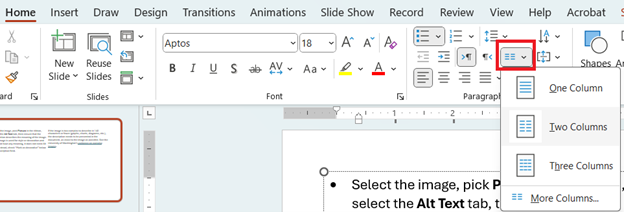
Columns
If columns are used, confirm that the columnar format is enabled. Place the cursor on the columnar text and navigate to Home > Paragraph > Add or Remove Columns. Confirm that the correct number of columns are highlighted.
Font
To provide the best accessible user experience, ensure fonts are easy to read and are not overly decorative.
- Check to see if the font is Serif or Sans-Serif.
- Note: this is not a WCAG AA requirement, but a best practice.
Reading Order
The reading order must match the visual layout.
- Navigate to Review > Check Accessibility > Reading Order Pane. Starting from the top of the selection pane moving towards the bottom, select each object and confirm that the order matches the visual layout. If it does not, you may reorder objects accordingly.
Object Formatting
If important information is contained in the header, footer or watermarks, it must be accessible to assistive technologies. To confirm, the information must be listed in the Reading Order Pane. Navigate to Review > Check Accessibility > Reading Order Pane.
Style and Appearance
Slide Animation
Review the animation to make sure it is not flashing or moving quickly. Ensure that if it plays for longer than 5 seconds, there is a way to pause, stop, or hide it with both the mouse and keyboard.
Color & Contrast
Color
Do not rely on color alone to convey meaning.
- Do a visual check for situations like these, which show examples of the incorrect and correct use of color to convey meaning.
Text Contrast
Ensure appropriate color contrast so that content can be read by people with visual impairments.
- Review WebAIM’s Contrast and Color Accessibility
- Visually inspect the text/background combinations, including images of text (except for logos, photographs, or where the text is incidental).
- If any look suspiciously low contrast, use the Colour Contrast Analyser or one of the evaluation methods suggested by WebAIM to verify whether the ratio meets WCAG 2.1 AA standards.
- 3:1 contrast ratio for text 18-point font (14-point bold) or above.
- 4.5:1 contrast ratio for text below 18-point font (14-point bold).
Graphical Contrast
Ensure appropriate color contrast of graphical elements so their meaning can be understood by people with visual impairments.
- The portions of graphics that are used to convey information (such as lines and bars on graphs, slices of a pie chart, and icons) have at least a 3:1 contrast ratio between itself and the background color.
- Logos, flags, pictures of real-life scenes, and graphics that represent other things (such as screenshots and biological schematic diagrams) are excluded from this requirement.
- Use the Colour Contrast Analyser to verify.
- See the Graphical Objects section of the WAI Understanding Non-Text Contrast page for examples
Images
Images
Meaningful images have alternative text and decorative images are hidden from screen readers.
- Select the image, pick Picture in the ribbon, select the Alt Text tab, then ensure that the description describes the meaning of the image.
- If the image is used for style or decoration and does not have any meaning, it does not need Alt Text. Instead, check “Mark as decorative” below the description field.
- If the image is too complex to describe in 140 characters or fewer (graphs, charts, diagrams, etc.), the description needs to be presented in the document, as close to the image as possible. See the University of Washington’s guidance on complex images.
Images of Text
Real text is used instead of images of text.
- Visually inspect the document for text that cannot be adjusted using the font settings.
- Unless the image is a logo or is otherwise essential, replace the image of text with real text.
Tables
Tables have logical structure.
- Visually inspect the table: it should be as simple as possible — no merged or split cells.
- Check to see if the first row is a header row
- Select first row, navigate to Table Design and confirm “Header Row” is selected.
- Check for alt text
- Select the table, right-click and select “View Alt Text”. Add meaningful alt text if it is missing.
Hyperlinks
The purpose of each link can be determined from the link text.
- Review the display text to ensure the hyperlinks have a clear and accurate description of the link destination. Avoid using “click here,” "read more," or “link.”
Lists
Lists are programmatically defined.
- Lists should be created using the bullet or numbered list features located in the Home ribbon > Paragraph section.
Flashing Content & Embedded Video or Audio
Flashing Content
No content flashes more than three times per second.
- Verify that videos and moving graphics (e.g., GIFs) do not flash or blink more than three times per second.
Embedded Video or Audio
Have appropriate text alternatives and audio descriptions.
- See Producing Accessible Video, Audio and Multimedia Content for additional information.
Additional Resources
Required Training
If you create PowerPoint Presentations that will be used to deliver information related to a program, service, or activity at OSU, you must take at least one of the following trainings: