What is an Accessible Word Document?
An accessible Word document means that everyone can access the content you create. There are a number of ways that you can improve the accessibility of your document to support those who use assistive technologies, as well as individuals with hearing, motor, and cognitive disorders.
The guidance on this page is intended to help users understand Word document accessibility requirements and to provide instruction to create accessible content. For detailed information on how to evaluate existing Word documents, please review Evaluating Word Documents for Accessibility.
How to Make Word Documents Accessible
Learning to creating an accessible Word document is something anyone can accomplish by following a few simple steps. Many of these accessibility concepts can also be applied to other applications such as PowerPoint, PDF, and websites.
Title
Make sure the file name and title (in the document metadata) describe the topic or purpose of the document. To find document metadata, navigate to File > Info > Properties > Title.
Language
It is important to ensure the correct language is set in the document so that screen readers read the document correctly.
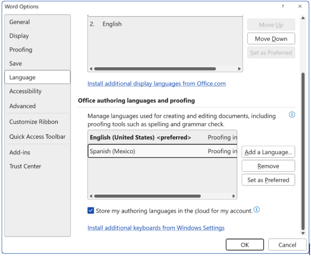
Document Language
In the US, the default language in a Word document is set to English. If the document’s primary language is not English, you should modify its language.
To modify a document’s language, go to Review > Language > Language Preferences. In the window, scroll down to “Office authoring languages and proofing” and select the language you wish to change it to (you may need to first install the language via the “Add a language” button). Press the OK button. Microsoft Word may prompt you to restart the application for the settings to go into effect.
Sections of Document in a Different Language
If a section of a document is in a different language, you should highlight that section and modify the language.
To modify language preferences, go to Review > Language > Set Proofing Language and make modifications as needed.
Structure
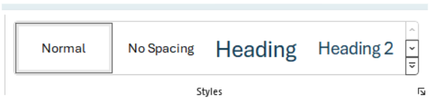
Headings
Provide outline structure to your documents by using headings. All users benefit from visual and logical structure, but this is critical to help screen reader users navigate the document and understand its contents. Headings should describe the topic or purpose of the content below them.
Word has six levels of headings, located in Home > Styles.
- Heading (Heading 1) should be primarily used for the title of the document you are creating.
- Headings should be used hierarchically/nested sequentially.
- You should not skip heading levels.
- Avoid adding an extra line above or below headings
To apply a heading, highlight the text and select the appropriate style. Users can also modify heading styles by selecting the heading, right-click, select modify, makes changes and select OK.
The following picture shows how you should be using headings within any documents you create
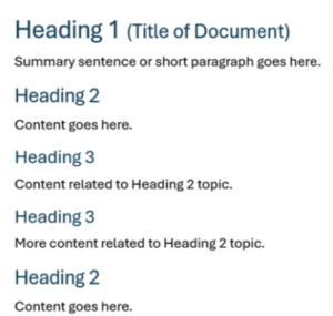
Table of Contents
For documents with several pages, a table of contents should be used and based on the heading structure. To add a table of contents, place the cursor where you would like to insert it. Click References > Table of Contents and choose an Automatic Table of Contents style.
Things to Avoid
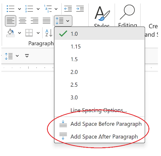
- Adding Spacing by Using the Return Key
- Avoid adding extra space by hitting the return key. This may cause confusion with screen readers and will require more effort to make the document accessible, especially if you are converting to PDF. If you need additional spacing, adjust the spacing using Word’s built-in feature found at Home > Paragraph > Spacing. There is a button to easily add or remove spacing between paragraphs in the Paragraph section in the Home tab.
- Using Full Justification
- Full justification adds extra spacing between the letters and words and makes it difficult to read the text, especially for users requiring magnification. Using left-hand justification is a best practice.
- Adding Important Information in the Header and Footer
- Some screen readers cannot access the header and footer, so important information should not be contained within these areas.
- Text Boxes
- Some screen readers cannot read text boxes and users may miss information. Some accessible alternatives include formatted styles that contain borders or single cell table to create an outline of the text.
Fonts & Text Styling
Use fonts that are easy to read. Overly decorative fonts should be avoided. Serif and sans-serif are universally accepted fonts for accessibility. Please note that this is not an OSU MDAS requirement, but best practice. Examples of serif and sans-serif fonts include:
- Arial (sans-serif, preferred alternative font for Buckeye Sans 2)
- Aptos (sans-serif, default font in Microsoft Office)
- Book Antiqua (serif)
- Buckeye Sans 2 and Buckeye Serif 2
- Helvetica (sans-serif)
- Georgia (serif, preferred alternative font for Buckeye Serif 2)
- Times New Roman (serif)
OSU Branded Fonts
When creating official Ohio State University content, use the approved Buckeye fonts: Buckeye Sans 2 and Buckeye Serif 2. The OSU Brand Center’s Fonts page offers guidance on font types, use, and provides information on how to download the Buckeye fonts.
Font Size
Font size should be at least 10 points. If printing, the document should use a 12-point or larger font.
Things to Avoid
- Word Art
- Text Effects
- Dropcap
Alternative Text for Images
Alternative text (or alt text) describes the content and purpose of the images used. Visually impaired users using screen readers will be read the alt text so that they can understand an image. Without this, users will be unable to get the same information as users without visual impairments. Alternative text is metadata added to an image that does not appear visually.
- Alt text should be clear and concise. The length is typically a few words but can be a couple of short sentences.
- Some images, such as graphs, charts, and diagrams, are too complex to be described using alt text alone. The meaning of these images needs to be presented in an alternative format, such as a table.
- If the image is used for style or decoration and does not have any meaning, it needs to be indicated as decorative so that screen readers ignore it. Select the image, pick Picture in the ribbon, select the Alt Text tab, then check “Mark as decorative.”
Resources
Check out these great resources to learn how to write effective alt-text:
- WebAIM Alternative Text
- WebAIM Alt Text Decision Tree
- Microsoft Effective Alt Text
- DIAGRAM Center Image Description Guidelines – contains detailed guidance on writing text alternatives for a variety of image types, including drawings, diagrams, charts, maps, and more
Tables
Simple tables can be used to organize data in rows and columns. To create a table in Word, go to Insert > Table and choose the appropriate number of rows and columns.
Set Header Row and Adding Alternative Text
- With the table selected, make sure the table has headers by navigating to Table Design > Table Style Options > select Header Row. You can now add headings to the top row of your table.
- Next, right-click on the top row of the table and choose Table Properties. On the Row tab, navigate to Options, and select “Repeat as head row at the top of each page”.
- While still in Table Properties, select the Alt Text tab. Add a meaningful description and briefly summarize the nature of the table's content.
Things to Avoid
Screen readers keep track of their location within a table by counting cells. For this reason, it’s important that the table does not contain merged cells, split cells or nested tables.
Links
Making links accessible means making them perceivable (visually distinct from surrounding text) and making the purpose or destination of the link understandable. The display text for hyperlinks should be clear and provide an accurate description of the link destination.
Good Example: To learn more about digital accessibility visit OSU’s Digital Accessibility Services' website.
Bad Example: To learn more about digital accessibility click here.
For step-by-step information on how to create hyperlinks, see Microsoft’s hyperlink guidance.
Things to Avoid
- Avoid labeling a link as “click here,” "read more," or “link.” Screen readers have shortcuts for users to skip to links on a page or there is functionality for users to generate a list of links on a page. When link titles are vague, such as “click here” or “read more” the user has no context for the link content.
- In electronic documents, avoid displaying the full URL because a screen reader may read it out one letter at a time. If the purpose of the document is to be printed, then it’s appropriate to spell out the entire URL.
Color and Contrast
Color
If color is used to convey meaning, it must be accompanied by a text description and/or a secondary visual signifier such as a pattern or icon. This is important for users that are not able to distinguish colors.
The University of Michigan offers some great illustrations to ensure correct practices on their page: Color as the Only Indicator of Meaning.
Contrast
To ensure text is perceivable, there must be sufficient contrast between the text color and background color. Contrast is measured by the difference in perceived brightness of two colors, commonly referred to as its “contrast ratio.”
To help understand the ratios, white text on a white background has a contrast ratio of 1:1. Black text on a white background is 21:1.
Requirements for contrast are as follows:
- Small Text: Text under 18-point regular font (14-point bold) must have a minimum 4.5:1 ratio with the background.
- Large Text: Text at or above 18-point font (14-point bold) must have a contrast ratio of at least 3:1 with the background.
Resources
- WebAIM offers some great examples of color contrast on its page WebAIM Contrast and Color Accessibility.
- Colour Contrast Analyser tool: This is available for all OSU employees but requires installation via download. Please contact the IT Service Desk 614-688-4357 for assistance. Once the tool is downloaded, watch GSA’s Module 14: Color Contrast Analyzer video for a quick tutorial.
Lists
Use Word’s built-in list feature found at Home > Paragraph to create an ordered (numbered) or unordered (bullet) list.
Ordered lists should be used when list items need to be understood in a specific order. Unordered lists should be used when the order of the items does not matter.
Thing to Avoid
- You should avoid creating lists by using tabs and spaces to create indents. Screen readers may announce these to users as “Blank, blank, blank”.
Automated Accessibility Checker
Before sharing your document, always run the Accessibility Checker and fix the issues it identifies to help ensure people with disabilities can easily access the content. To run the Accessibility Checker:
- Select the Review tab on the ribbon.
- Select Check Accessibility or
Keyboard Navigation: Alt+R, A, 1, A.
For detailed instructions on running the Accessibility Checker and applying recommended actions, review Microsoft’s Accessibility Checker guidance.
Additional Resources
- Deque Document Accessibility: Microsoft Word Checklist
- Microsoft Word Best Practices for Accessibility: To find information on best practices, remediation of accessibility issues, and information on using the accessibility checker.
Required Training
If you create Word documents that will be used to deliver information related to a program, service, or activity at OSU, you must take at least one of the following trainings:
Credit
The OSU Digital Accessibility team would like to thank the following for sharing some of their digital accessibility best practices and guidance: OSU Engineering Technology Services, OSU Wexner Medical Center - Marketing and Strategic Communications, IT Accessibility at the University of Michigan, and University of Arkansas Explore Access.